Desktop Publishing Rules of Thumb
Along the years I've seen many reports being written in the horrid default Microsoft Word style. OpenOffice.org's default style is just as horrid because of compatability reasons. The following are rules of thumb explaining how to properly layout a report:
Fonts
Always try to use the least number of fonts you can. For most documents this means you end up using either two or three fonts, depending whether you want to give your document (respectively) a traditional or contemporary look. For a traditional look, use a single serif font for both headers and body text. If you rather like a contemporary look, use a sans-serif font for the headers and a serif font for the body text. In both cases you might need to use a monospaced font to display screen dumps and the likes. The font size for your body text should always be either 10, 11 or 12pts.
While there there is not much fundamentally wrong with Times New Roman, Arial and Courier, they just reek of laksness, and basically say to the reading 'I didn't care!'.
Instead of using Times New Roman, try Palatino or a Garamond. Arial being a bad Helvetica ripoff, should be replaced even more so, for example try Frutiger, Gill Sans, Andale Sans, Univers, Akzidenz-Grotesk. And last but not least, Courier could be replaced by Prestige, Andale Mono or Vera Sans Mono.
Margins
Don't be afraid of white space, white space is your friend. All documents should at least have margins of 2.5cm, preferably even larger, 3.0cm or 3.5cm is not too much. LaTeX even uses 4.0cm for it's innner and outer margins, and that's just fine.
Large margins are a good place to grip the document, making sure your fingers aren't obscuring any text. For teachers, mentors and reviewers it's also an ideal place to scribble notes and corrections.
Line Width
There are several available rules of thumb concerning line width, they're all different, yet very similar. Some folks say each line should hold about 10-12 words, other say 12-14 words. Yet another crowd tells you to put the letters A-Z, a-z, 0-9 on a line as a guide. If you compare these methods (and some others) it basically boils down to the following, always keep on average between 10-15 words per line of text.
Reading lines shorter than 10 words will disturb the sentence flow too often, while lines larger than 15 words will be tiring, because of excessive eye movement.
Ofcourse you can't configure a line width anywhere so you must experiment the font size and margins accordingly.
Line Spacing
I always prefer a proportional line spacing between 110% and 120%. Having lines stuck too close to each other, may cause the eye to unintentionally switch between lines. But having lines be too far apart will disturb the sentence flow, because the eye needs to search where the next line starts.
Dont's
Do not type two spaces after a dot. This is a remnant of the typewriter era, where the double space would cue the brain a new sentence was about to start. But modern proportional fonts obsoleted this custom.
Do not use a non-proportional font for your body text. Non-proportional fonts are harder to read, and cause eye strain.
Do not mix TrueType and Type1 fonts in your document (especially when exporting to PDF). Different operating systems have different font renderers, and may render either TT or T1 fonts more crisp or blurry. Sticking with one type will keep your document looking consistent.
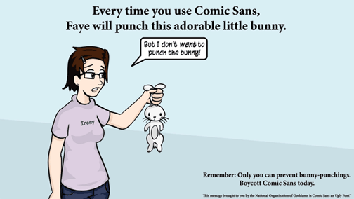
Do not use Comic Sans. Only you can prevent bunny punchings:


0 Comments:
Post a Comment
<< Home