Pascal's TechBlog

Wednesday, June 21, 2006

Migration Notice

I will no longer update this blog.

My new blog can be found at blog.pcode.nl.

Monday, June 19, 2006

Globally Compatible Paper Size

One of the reasons I dislike country's like the US of A is because they keep on clamping to their own medieval (and illogical) standards, for example, they haven't accepted the metric system there yet, the Inch and Mile are still the standard measure of distance.

The same thing goes for paper standards, almost the whole world has embraced ISO 216 and standardized on A4. But not the US, no, no... They still keep on using their Letter format.

When exporting documents to PDF for distribution, this raises issues. As both formats are incompatible with each other. A4 has more height, and Letter has more width. So when printing either of the formats to the other on paper implies the document gets scaled (best case) or the margins get cropped (worst case).

So I'm proposing a solution to this debacle which is quite simple: create your documents using the lowest common denominator of the paper metrics. This means using the width of A4 and the height of Letter: 210mm x 279mm.

Extracting Fonts from PDFs

Have you ever come across a PDF, which uses some really cool fonts, but you can't seem to get a hold of them... Here's a solution, you can extract font from PDFs! It's possible!

There are some drawbacks though, in many (and probably most) cases it won't be either legal or moral to extract a font from a PDF and then use it without paying a licensing fee. Next most PDF creators only embed a subset of characters into the PDF, which means you won't get a complete character set. This basically means this method is only useful for sampling...

Now first you'll need to convert the PDF to an old school PostScript file like so:
# pdftops 1Rules.pdf

Next open the 1Rules.ps file with your favorite text editor and search for the following:
%%BeginResource: font CIKHFG+Schoensperger-Modified
%!FontType1-1.0: CIKHFG+Schoensperger-Modified
12 dict begin
/FontInfo 10 dict dup begin
/Notice (©1991 FontFontRevival; FontShop International ¥ Modified by Marc G @ the Black Library 7/99 so we can write the word 'Skaven' properly.) readonly def

...

cleartomark
%%EndResource

Copy that excluding the %%BeginResource and %%EndResource lines to a new textfile, which you can then save using a .pfa extension.
Open the newly created .pfa file with FontForge, and reencode the font as Latin1 (Encoding - Reencode - Latin1), and compact the font (Encoding - Compact). Because of the embedding the font's name will be garbled, so you'll want to adjust that (Element - Font Info - Names). Finally you can generate a TrueType or PostScript Type1 font to your liking (File - Generate Fonts).

Friday, June 16, 2006

Desktop Publishing Rules of Thumb

Along the years I've seen many reports being written in the horrid default Microsoft Word style. OpenOffice.org's default style is just as horrid because of compatability reasons. The following are rules of thumb explaining how to properly layout a report:

Fonts
Always try to use the least number of fonts you can. For most documents this means you end up using either two or three fonts, depending whether you want to give your document (respectively) a traditional or contemporary look. For a traditional look, use a single serif font for both headers and body text. If you rather like a contemporary look, use a sans-serif font for the headers and a serif font for the body text. In both cases you might need to use a monospaced font to display screen dumps and the likes. The font size for your body text should always be either 10, 11 or 12pts.
While there there is not much fundamentally wrong with Times New Roman, Arial and Courier, they just reek of laksness, and basically say to the reading 'I didn't care!'.
Instead of using Times New Roman, try Palatino or a Garamond. Arial being a bad Helvetica ripoff, should be replaced even more so, for example try Frutiger, Gill Sans, Andale Sans, Univers, Akzidenz-Grotesk. And last but not least, Courier could be replaced by Prestige, Andale Mono or Vera Sans Mono.

Margins
Don't be afraid of white space, white space is your friend. All documents should at least have margins of 2.5cm, preferably even larger, 3.0cm or 3.5cm is not too much. LaTeX even uses 4.0cm for it's innner and outer margins, and that's just fine.
Large margins are a good place to grip the document, making sure your fingers aren't obscuring any text. For teachers, mentors and reviewers it's also an ideal place to scribble notes and corrections.

Line Width
There are several available rules of thumb concerning line width, they're all different, yet very similar. Some folks say each line should hold about 10-12 words, other say 12-14 words. Yet another crowd tells you to put the letters A-Z, a-z, 0-9 on a line as a guide. If you compare these methods (and some others) it basically boils down to the following, always keep on average between 10-15 words per line of text.
Reading lines shorter than 10 words will disturb the sentence flow too often, while lines larger than 15 words will be tiring, because of excessive eye movement.
Ofcourse you can't configure a line width anywhere so you must experiment the font size and margins accordingly.

Line Spacing
I always prefer a proportional line spacing between 110% and 120%. Having lines stuck too close to each other, may cause the eye to unintentionally switch between lines. But having lines be too far apart will disturb the sentence flow, because the eye needs to search where the next line starts.

Dont's
Do not type two spaces after a dot. This is a remnant of the typewriter era, where the double space would cue the brain a new sentence was about to start. But modern proportional fonts obsoleted this custom.
Do not use a non-proportional font for your body text. Non-proportional fonts are harder to read, and cause eye strain.
Do not mix TrueType and Type1 fonts in your document (especially when exporting to PDF). Different operating systems have different font renderers, and may render either TT or T1 fonts more crisp or blurry. Sticking with one type will keep your document looking consistent.
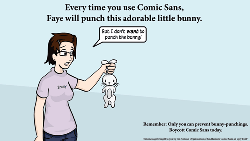
Do not use Comic Sans. Only you can prevent bunny punchings:

RichText Mail?

During my participation in the Exchange Server 2003 course, it has come to my attention that Outlook and Exchange actually use RichText Format when MAPI is used to send or receive mails. Only when mails are sent using SMTP, POP3 or IMAP4 is the mail converted to plain text or HTML.

Nuff said...

Sunday, June 11, 2006

OpenOffice.org templates packaged

I managed to create a quick and dirty Ubuntu package of my OpenOffice.org humanist templates. The package contains the following five templates:
  • Humanist Presentation
  • Humanist Report (A4, Letter)
  • Humanist Curriculum Vitae (A4, Letter)
You can download the Ubuntu package here, and either double click the package or install it like this:
$ sudo dpkg -i openoffice.org-humanist-templates_0.4-2_all.deb

UPDATE: I updated the package to remove the spaces from the templates.

Lawrence Lessig: What have you done?

I ran acros this old keynote from Lawrence Lessig the other day. It's a really good keynote where he makes a point out of the fact that most people talk about their ever decreasing freedoms, but never actually do anything substantial about it (like, for example, supporting EFF).

Sun Java 5 Fonts

If you fiddle a bit with Synaptic you'll notice that the Sun Java 5 JRE/JDK has a package called sun-java5-fonts. What this package basically does is install the fonts (which are normally exclusively accessible by Java itself) and make them available to defoma. The Sun Java 5 Fonts package contains Lucida Bright, Lucida Sans and Lucida Typewriter. After installing these fonts, try visiting Slashdot again, it looks stunning!

UPDATE: You might need to run 'sudo fc-cache -v' to update your font cache.

Double One!

For those of you, who know what this means: Yes, I do like to gloat!

Friday, June 09, 2006

CorelDRAW! 9 Fonts

While going through my stuff the other day, I found an old student license of the CorelDRAW! 9 graphics suite. I popped in the CD and found a goldmine of professional fonts. Most fonts included with CorelDRAW! are from the Bitstream foundy (which also did the Vera fonts included with GNOME). Here's a short list of the Bitstream fonts:
All of these Bitstream fonts are properly hinted to produce good onscreen results when rendered with FreeType, the open source font rendering engine which is used by GNOME.

After inspecting the CorelDRAW! EULA I couldn't find anything prohibiting me from separating the Bitstream fonts from the rest of CorelDRAW! as long as I didn't have CorelDRAW! and/or the Bitstream fonts installed elsewhere.

Eben Moglen Keynote

For all the folks who haven't seen Eben Moglen's Keynote at the Red Hat summit yet: you really really need to see it. It's available in several formats: Quicktime, Real, Ogg. Download it now!

Monday, June 05, 2006

Thom's comments on Ubuntu's GNOME

After reading reading Thom Holwerda's post about Ubuntu's GNOME, I noticed that most of his complains were either bugs or works in progress, except for this one:

"GNOME needs a better default layout for its panels. The top bar is wasting an insane amount of space; to the left, we have a few menus and icons, and all the way to the far right we have the system tray and clock. In between, it's all gray. A solution would be to place the taskbar in between those two ends, but on most screens, the space there is just a little too limited to comfortably house the taskbar. Other than that, the top bar becomes extremely cluttered if it also houses the taskbar."

Thom seems to put space efficiency on par with usability, which in't necessarily true. Well, actually those will often be antithetical to each other.
Also the uselessness with which Thom portraits the empty space in the upper panel is hardly deserved. It can be quite handy for placing launchers (for Epiphany, Evolution, etc), and applets (Tomboy Notes, System Monitor, Weather Report, Network Manager, etc).
Housing the taskbar in the upper panel seems like an extremely bad idea, because most important the available space is much too small, so when a lot of applications are opened the application bars are so small, it'll be impossible to differentiate between them, and the taskbar loses it's primary functionality. That's the brillance of putting the taskbar in the lower panel, where there's plenty of room.

"Ubuntu still does not pass my ZipDisk test; nor does any other distribution for that matter. My desktop x86 has an internal IDE ZipDisk drive (250MB), and no matter what distribution I install, neither of them configures fstab correctly so I can use my ZipDisk instantly. And that's for an internal one-- don't get me started on any of my 6 external (parallel) drives. I never got those to work with any operating system (except Windows, as Iomega has drivers for that, obviously). By the way, BeOS/Zeta also passes the internal part of the ZipDisk test."

While Thom is right from a fundamental point of view, having plug and play ZipDisk support seems hardly relevant anymore. ZipDisks were never really popular, so investing a lot of effort in to this would be a waste of time. And considering a wonderful new technology called 'USB Memory Sticks' it would seem silly at best.

Saturday, June 03, 2006

VMware Player

While reading Planet Ubuntu NL, I noticed Nicolas' post about the fact that VMware Player was now prepackaged in Dapper. Thanks for the tip!

Anyway this is great! Really! The best part about having VMware Player prepackaged is the fact that the user doesn't have to compile the kernel modules manually anymore. Sweet...

BlackAdder II

While re-watching the BlackAdder series, I noticed in the Potato episode of BlackAdder II, Simon Jones makes an appearance Sir Walter Raleigh, the seafarer. Simon Jones is probably most famous for his role in the original BCC series of The HitchHikers Guide to the Galaxy as Arthur Dent.